App Center, Ubuntu’s Flutter-based replacement for the Ubuntu Software app, has picked up a redesigned app icon in the latest Ubuntu 24.04 daily builds.
This isn’t the first icon change that the App Center has received in recent months.
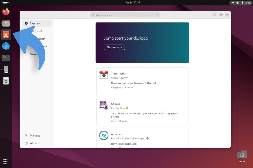
An updated build of the software installation frontend rolled out a few months back, and it unintentionally swapped the full-colour, 3D Yaru icon for a flat, 2D, solid orange icon with transparent elements. While a subsequent update fixed the issue some users say they still see the ‘wrong icon’.
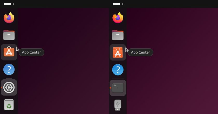
Now the App Center icon has changed again — though this time the swap is entirely intentional:
The new App Center icon isn’t hugely different. It’s still an orange shopping bag. But the bag itself is taller, and the right stalk of the “A” in the middle of the icon has more of a shadowed/folded paper effect than the one it replaces.
Canonical’s design team committed the new icon without adding any details. No rationale behind updating the icon, how it’s better, or what is wrong with the existing Yaru icon. Not that it matters – unlike the 2D glyph accidentally pushed out, this replacement doesn’t look out of place.
I don’t expect most people will notice a difference.
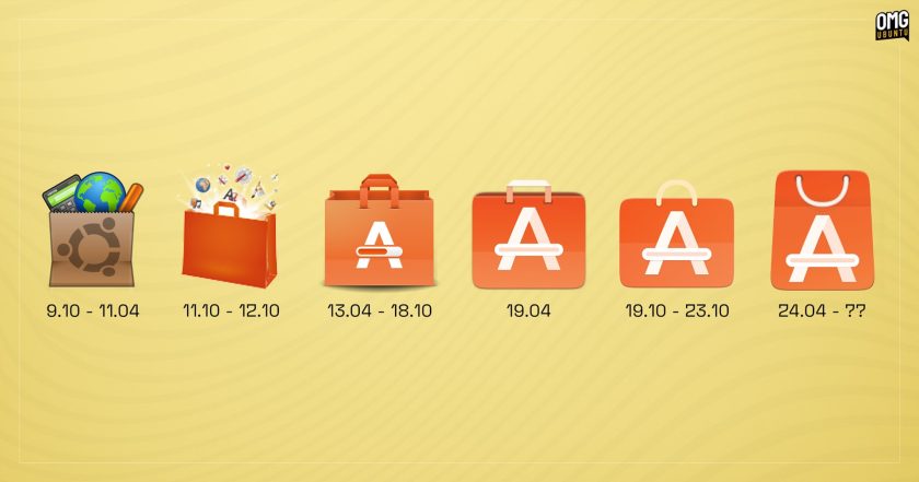
For fun, here’s how the icons for the Ubuntu Software/App Center have evolved over the years (of course, they’ve not all been the same underlying app, but regardless of name, toolkit, etc the app has served the same purpose):

If you’re using Ubuntu 24.04 daily builds then you may or may not have this icon already. If you don’t, you could run sudo snap refresh to see if the updated snap-store is waiting — I only have see this new icon on 1 of my 3 24.04 installs (1 has the “accidental” icon, and 1 has the old Yaru icon).
Update April: based on feedback the Yaru community design team has tweaked the new icon to better match other Yaru icons. I’ve updated the evolution graphic with the revised version, but here’s a closer look at it:
What do you think of it? Let me know!


